
The Challenge
What I Did
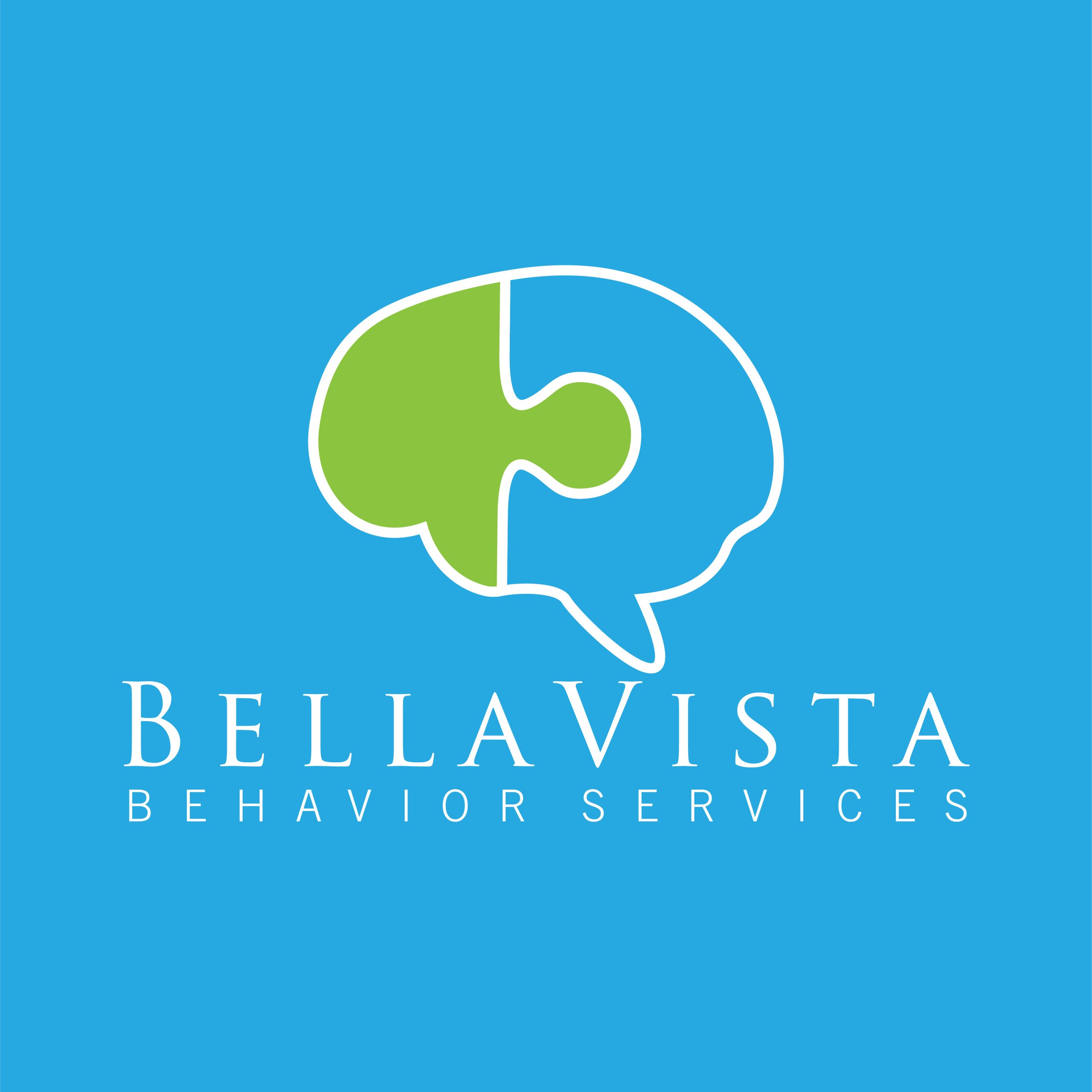
According to the Autism Society, “The Autism Awareness Ribbon — The puzzle pattern reflects the complexity of the autism spectrum. The different colors and shapes represent the diversity of the people and families living with the condition. The brightness of the ribbon signals hope — hope that through increased awareness of autism, and through early intervention and access to appropriate services/supports, people with autism will lead full lives able to interact with the world on the own terms.”
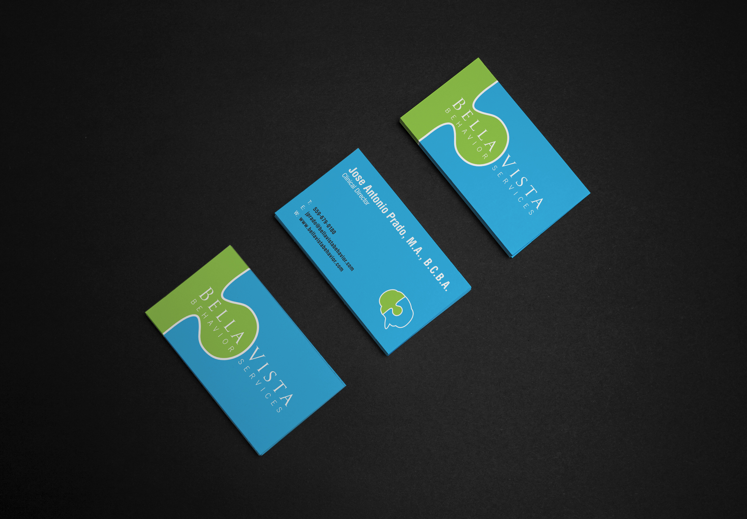
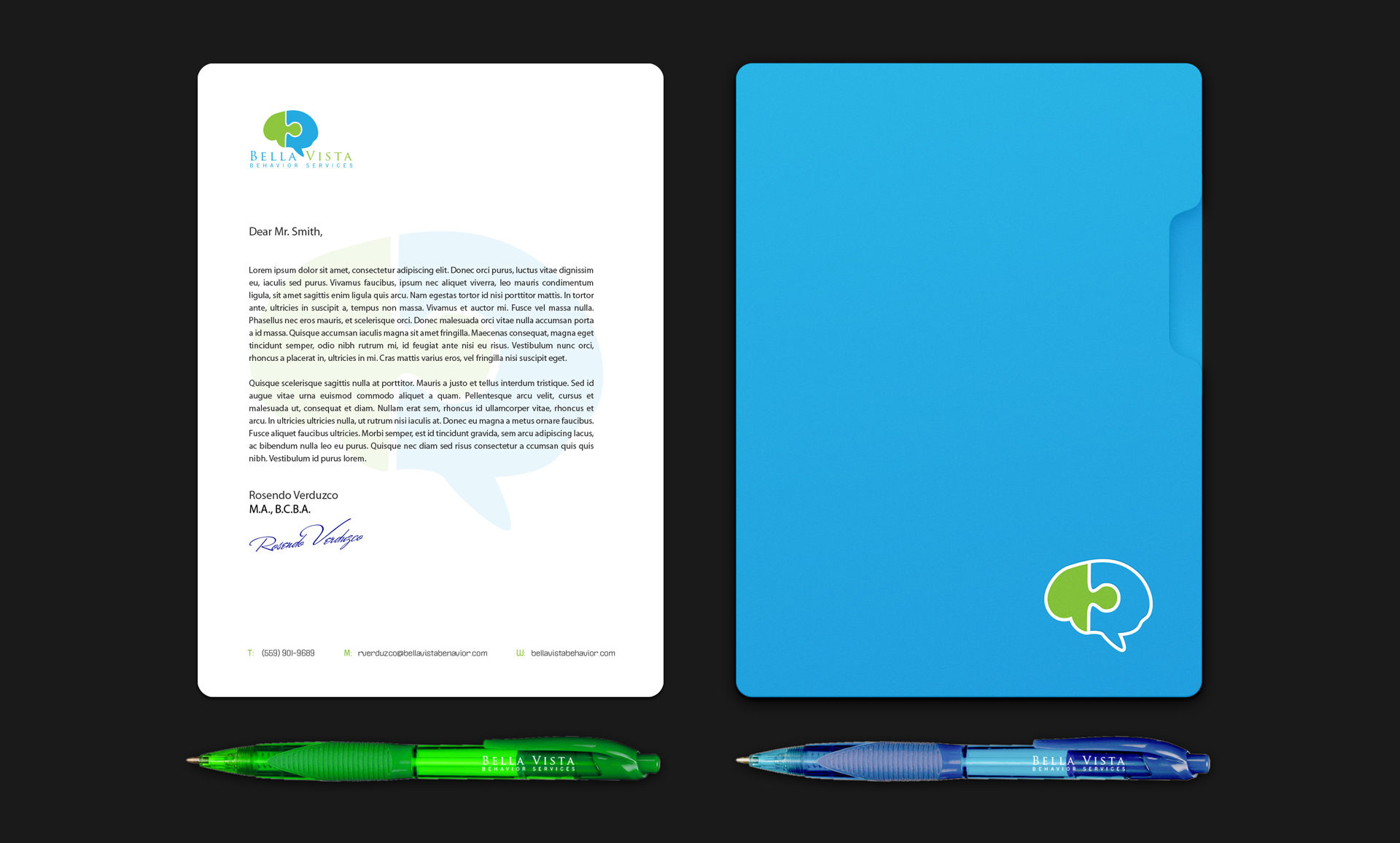
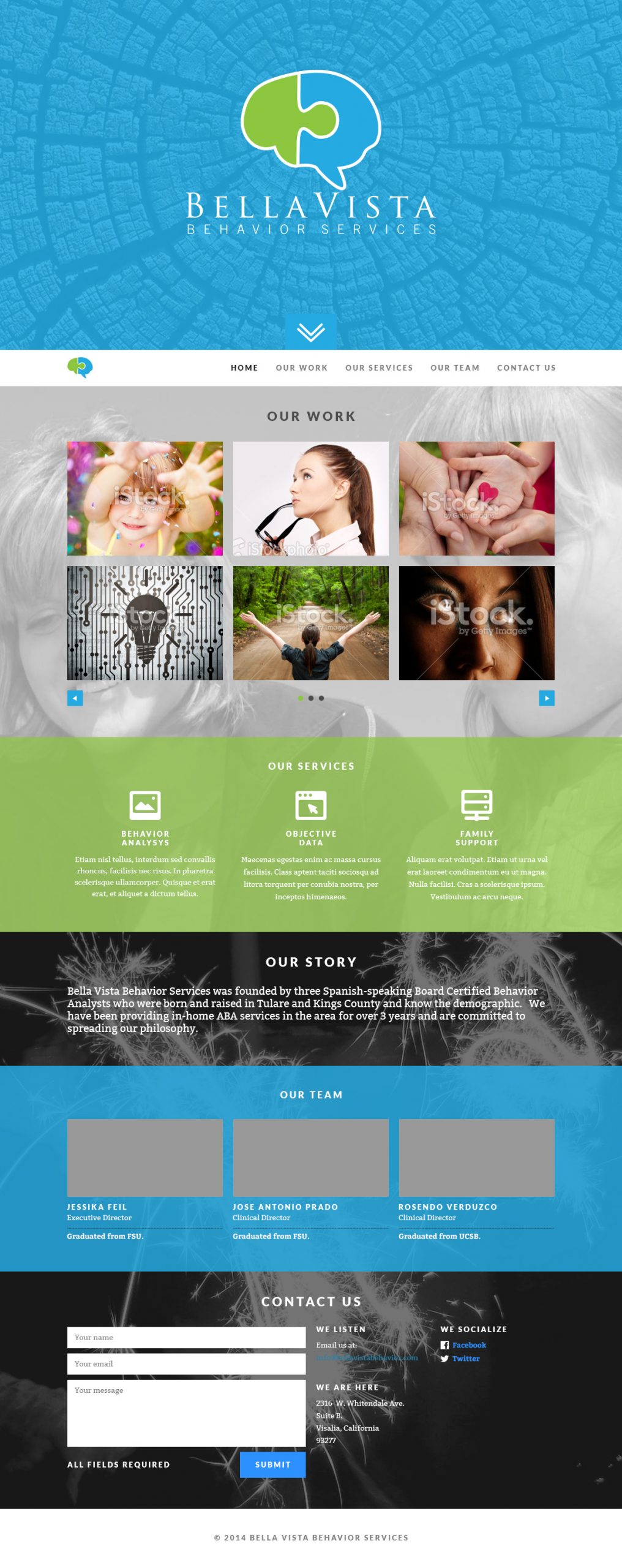
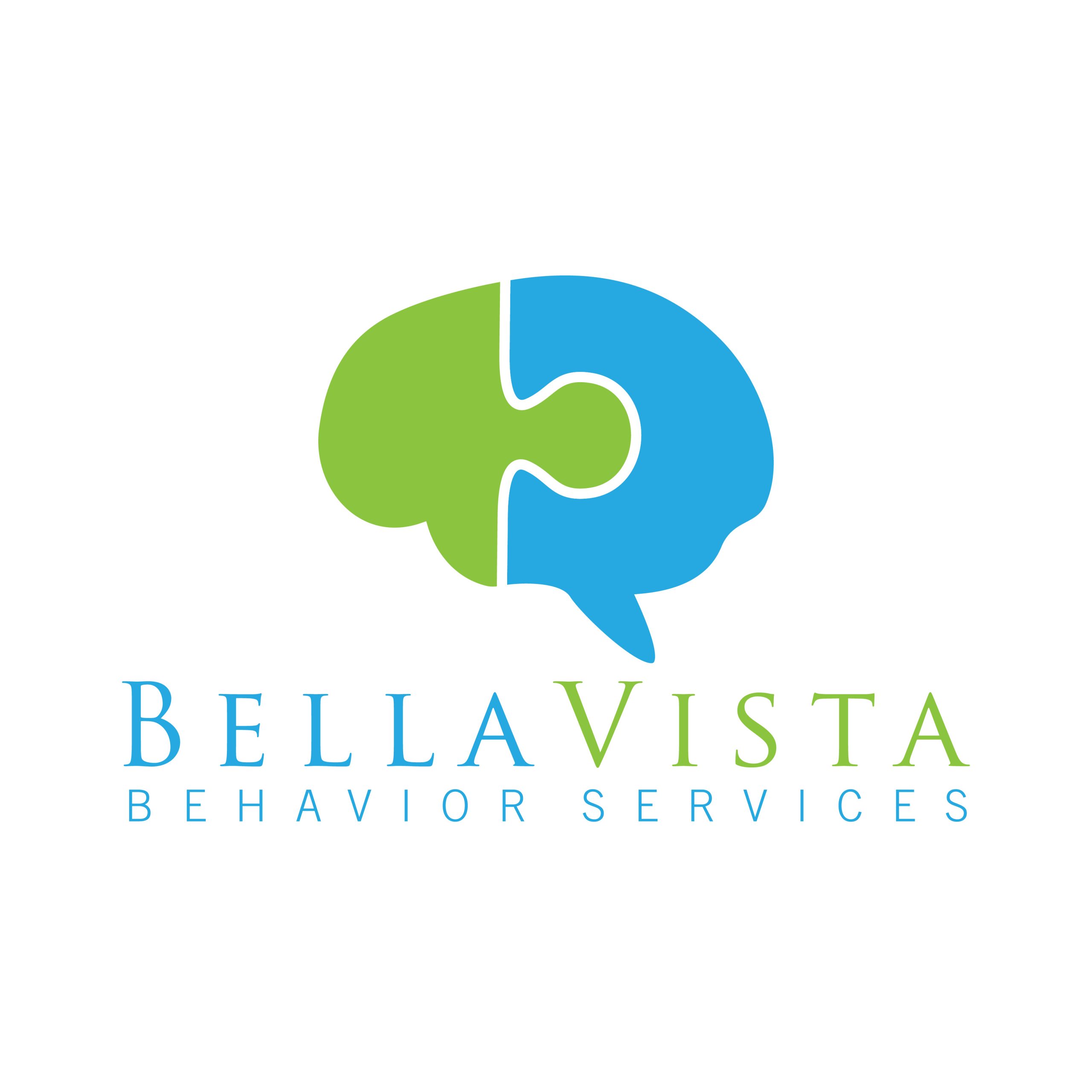
Originally, the logo had 8 puzzle pieces and then we halved that on a redesign and then halved that even more upon further refinement. The result is a very simple close-up of a puzzle piece contained inside the complex machine that is our brain. It fit neatly as a standalone symbol and as part of its typography counterpart. Once the logo and the colors were settled upon, the website followed. That’s shown here is the original draft before buildout. You can visit the finished website at the button down below.
I knew next to nothing about autism prior to taking this project on and it taught me a lot of things that I was, quite frankly, very ignorant about. There is an infinite amount that I still don’t know. That’s kind of what learning is all about. For more information about Autism Awareness, please visit the Autism Society’s website.
Client
Visalia, CA